


Why the 10-year gilt yield matters
The 10-year gilt yield is one of those indicators that seems reserved for traders, economists, and central bank watchers. In practice, it touches far more than bond desks. It helps shape mortgage pricing, corporate borrowing costs, pension liabilities, infrastructure financing, and even how aggressively businesses can plan capital spending. For a country like the UK, where public finance, inflation, and monetary policy are tightly watched, the 10-year gilt is a useful shorthand for market confidence.
Think of it as a live price tag on UK government borrowing over a decade. When the yield rises, the price of the gilt falls, and vice versa. Simple enough in theory. In reality, the chart reflects a mix of inflation expectations, Bank of England policy, fiscal credibility, global risk appetite, and periodic bouts of market stress. If the chart looks noisy, that is because the market is constantly reassessing what the next ten years might bring.
For businesses, the key question is not just where the yield is today, but what the trend says about financing conditions tomorrow. Is the market pricing a slowdown? A stickier inflation path? A more cautious central bank? Or just a temporary swing in sentiment after a data release or budget statement? The answer is often all of the above.
What the chart has been telling us
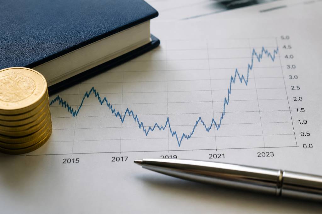
A 10-year gilt yields chart over the past several years tells a fairly clear story: ultra-low yields during the era of emergency monetary support, a sharp repricing as inflation returned, then a more volatile period as investors tried to balance slowing growth against stubborn price pressures. In other words, the chart has moved from calm to chaos to something closer to uneasy normalisation.
Before the inflation shock of 2021-2022, long-dated gilt yields were historically subdued. That environment reflected years of low growth, low inflation, and heavy central bank intervention. Government bond markets were also supported by asset purchases from the Bank of England. The message from the chart was straightforward: markets expected weak nominal growth and little reason for yields to surge.
Then inflation arrived with uncomfortable persistence. Energy prices spiked, supply chains were strained, labour markets tightened, and the Bank of England had to pivot quickly. The 10-year gilt yield rose materially as markets repriced inflation risk and expected higher policy rates for longer. The chart stopped looking like a placid slope and started resembling a heartbeat monitor.
That mattered because long-term yields influence the cost of capital far beyond the sovereign market. For businesses, higher gilt yields tend to feed into higher corporate bond yields, higher discount rates used in investment appraisal, and more expensive refinancing. If you are planning a warehouse expansion, fleet renewal, or industrial equipment upgrade, that shift changes the maths fast.
What drives the 10-year gilt yield
There is no single lever behind the chart. The 10-year gilt yield is shaped by several forces at once:
- Inflation expectations: if markets believe inflation will stay above target, they demand higher yields.
- Bank of England policy: tighter policy usually pushes yields higher, especially at the front end, but it can affect the long end too.
- Economic growth outlook: stronger growth can support higher yields, while recession fears often pull them down.
- Fiscal credibility: large deficits, weak tax receipts, or unfunded spending plans can raise risk premia.
- Global bond market moves: UK gilts do not trade in isolation; US Treasuries and eurozone bunds matter a lot.
- Investor demand: pension funds, insurers, foreign buyers, and domestic institutions all influence pricing.
One of the most useful things about the chart is that it compresses all these variables into one line. That is also its weakness. A rising yield can mean stronger growth, higher inflation, fiscal concern, or a simple repricing after a hot jobs report. The chart gives you the signal, but not the full diagnosis.
That is why analysts rarely look at the 10-year gilt alone. They compare it with 2-year yields, 5-year yields, inflation breakevens, swap rates, and sterling moves. The shape of the curve can tell you whether markets expect policy tightening, stagnation, or a future rate cut cycle. The 10-year point sits in the middle of that conversation, where short-term policy and long-term confidence meet.
Recent trends: from policy shock to market recalibration
The post-pandemic period has been a stress test for government bond markets. Inflation surprised on the upside, central banks moved aggressively, and investors had to abandon the idea that rates would stay low indefinitely. In the UK, the gilt market also had to absorb fiscal uncertainty and the legacy of extraordinary monetary support.
One vivid episode was the sharp repricing during the mini-budget crisis in 2022, when gilt yields spiked and market functioning was strained. That event is worth remembering because it showed how quickly confidence can evaporate when fiscal policy, inflation fears, and leverage collide. The lesson was blunt: bond markets dislike surprises, especially when the UK’s financing needs are large and the policy narrative appears unstable.
Since then, the chart has been more orderly, but not exactly serene. As inflation eased from its peaks, yields retraced some of the earlier surge. However, the market has remained sensitive to wage data, services inflation, and signals from the Bank of England about how long rates might stay restrictive. Even when inflation falls, the market does not automatically return to the old low-yield regime. Investors now want proof, not promises.
This is an important change. In the years after the financial crisis, markets were conditioned to expect central banks to step in quickly and keep yields compressed. Today, the baseline assumption is more cautious. Higher-for-longer rate expectations have become part of the framework, and the 10-year gilt chart reflects that shift.
Why businesses should care, not just economists
It is easy to treat bond yields as macro wallpaper. That would be a mistake. The 10-year gilt yield feeds directly into commercial decision-making, especially in capital-intensive sectors such as manufacturing, logistics, property, energy, and infrastructure.
For example, if a logistics operator is deciding whether to finance a new distribution centre, the gilt market affects the benchmark against which lenders price the debt. A company that could borrow cheaply a few years ago may now face a materially higher interest bill. That can change project viability, delay investment, or push firms to seek shorter payback periods.
Pension funds and insurers are also highly sensitive to gilt yields. When yields rise, long-duration liabilities can be discounted at a higher rate, which changes funding positions. That may sound technical, but it matters for employer contributions, de-risking strategies, and asset allocation. A seemingly abstract movement in the 10-year chart can influence how much cash a business needs to set aside for the future.
Even exporters and importers should pay attention. Gilt yields can affect sterling, and sterling can affect competitiveness. A stronger currency may reduce input costs for some firms but pressure foreign revenues. The relationship is not mechanical, but it is real enough to deserve a place in any finance director’s monitoring dashboard.
How to read the chart properly
A good chart reading starts with context. A 10-year gilt yield at 4% means something very different if inflation is 2% than if inflation is 6%. The real question is not the absolute level alone, but the yield relative to expected inflation and policy conditions.
Some practical ways to interpret the chart:
- Look at the trend over weeks and months, not just the daily move. Daily noise can be misleading.
- Compare the 10-year yield with the 2-year yield to understand the curve shape.
- Track inflation data, wage growth, and Bank of England guidance alongside the chart.
- Watch for sharp moves around fiscal events such as budgets, spending reviews, or debt issuance announcements.
- Check whether moves are UK-specific or part of a global bond sell-off.
There is also an important behavioural point. Markets often move ahead of the narrative. By the time analysts explain a yield rise in the news, the bond market may already have priced in the next few policy meetings. That is why finance teams should not wait for the headline story to react. The chart is often the early warning system.
Forecasting the next phase: what to watch
No one gets long-term bond forecasting right every time. If they did, they would probably not be writing columns; they would be on a beach somewhere. But the current outlook for 10-year gilt yields can be framed around a handful of plausible forces.
The first is inflation persistence. If services inflation and wage growth remain sticky, the market will likely keep a higher term premium in the yield. That would mean the chart stays elevated even if headline inflation keeps drifting lower.
The second is the growth picture. A softening UK economy tends to pull yields down, as investors price lower policy rates and weaker demand for credit. But that only goes so far if fiscal supply remains heavy or if markets worry about the credibility of medium-term public finances.
The third is the Bank of England’s path. Markets are always trying to infer whether the central bank will cut rates quickly, slowly, or not much at all. If cuts arrive sooner than expected, the 10-year yield may decline, though not always in a straight line. If the BoE stays cautious because inflation is not fully contained, yields could remain higher for longer.
Finally, global conditions matter more than many UK observers like to admit. US Treasury yields often set the tone for the global bond complex. If US long yields rise sharply, gilts may follow even if UK-specific fundamentals are unchanged. In bond markets, geography is real, but contagion is faster.
Scenario outlook for the coming quarters
Three broad scenarios are worth monitoring.
Base case: inflation continues to ease gradually, the Bank of England begins to normalise policy cautiously, and the 10-year gilt yield stabilises within a moderate range rather than breaking significantly higher. This is the most likely path if growth slows without a hard landing.
Upside yield scenario: inflation proves stickier than expected, wage growth stays elevated, and fiscal pressures raise concerns about debt issuance. In that case, the chart could push higher again, especially if global yields also rise. Businesses would face tighter financing conditions and more expensive long-term borrowing.
Downside yield scenario: growth disappoints sharply, demand weakens, and markets begin to price a faster easing cycle. That would likely pull the 10-year yield lower. For borrowers, that sounds positive. For the wider economy, it may signal softer demand and weaker investment sentiment.
The most realistic outcome is probably a range-bound market with intermittent spikes. That may not sound exciting, but markets rarely reward neat narratives. The key for firms is to build flexibility into financing plans rather than betting on one clean line down the chart.
What finance teams and operators should do now
For treasury, procurement, and investment teams, the message is practical: use the 10-year gilt chart as an input into planning, not as an afterthought. If your business depends on debt, leasing, or large capex decisions, bond yields should sit alongside energy prices, labour costs, and demand forecasts.
A few actions are worth considering:
- Stress-test borrowing costs under higher-yield scenarios.
- Review refinancing timelines before markets reprice sharply.
- Revisit hurdle rates for capital projects so investment decisions reflect current funding conditions.
- Monitor the yield curve, not just the headline 10-year point.
- Keep an eye on budget announcements and major inflation releases.
In many industries, margins are already under pressure from wages, energy, transport, and supply chain volatility. Ignoring the bond market is a luxury few balance sheets can afford. The 10-year gilt yield may not dominate the boardroom agenda, but it quietly shapes the cost of nearly everything a business does.
That is why the chart deserves attention. It is not only a financial market line. It is a reading of confidence, risk, and future expectations. And in a period when companies are trying to plan ahead with less certainty than usual, that makes it one of the more useful charts in the room.